Hotel Cerro Brand Guide
CULTURAL. CASUAL. HISTORICAL.
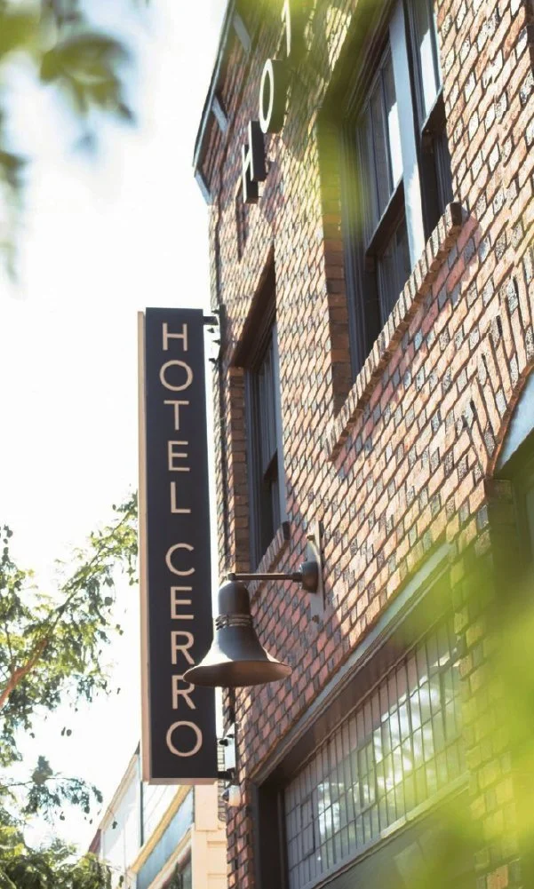
HOTEL CERRO
BRAND GUIDE
Client
Hotel Cerro, San Luis Obispo
Deliverables
Logo Families
Brand Guidelines
Illustrations
Photography
Branded Assets
Skills
Illustrator
InDesign
Photoshop
Lightroom
Paid
Brief
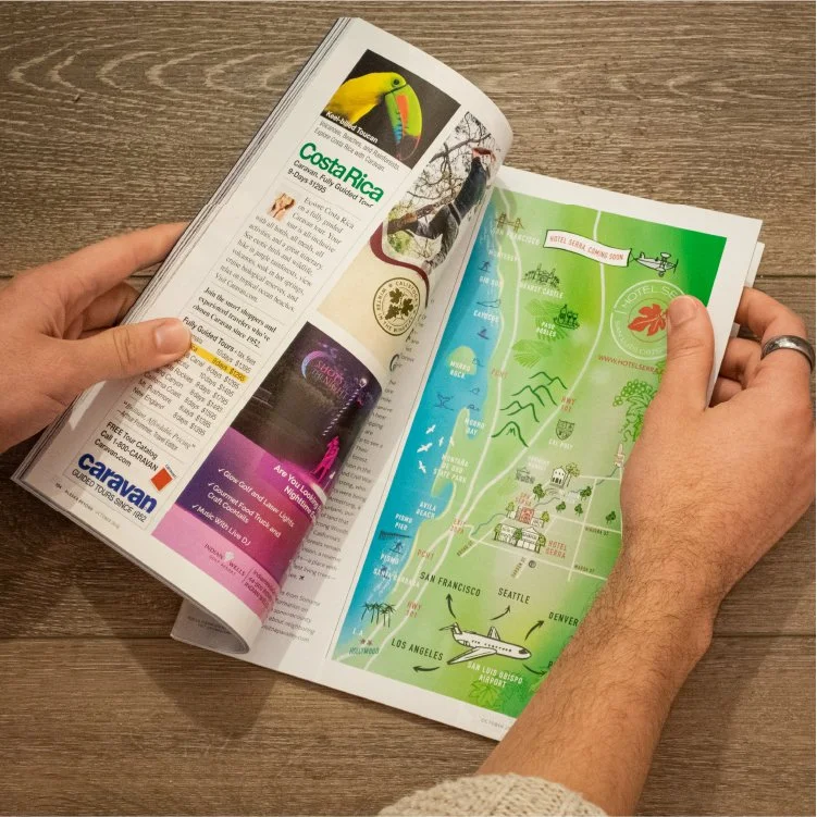
I worked as the Branding Designer, and later Marketing Manager, to create a full brand guide for Hotel Cerro and a handful of adjoining businesses. I was tasked with creating a luxury brand from scratch that could easily be extrapolated into a full-fledged experience for guests.
Goals
Create a set of guidelines that helped to emulate a feeling of casual luxury. Create timeless designs that could grow and expand as more of the hotel came online. Build out a system that felt foolproof so future designers and stakeholders could easily buy into the brand.
Outcomes
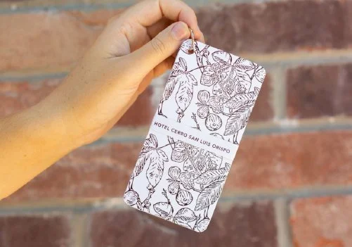
I designed a set of logos that then informed the brand framework of the hotel and its peripheral businesses: colors, fonts, several illustrations, a robust content library, a website, printed collateral templates, and much more. Once finalized, the Brand Guide contained the hotel’s mission statement, brand pillars, programming blueprint, and a full set of logos with their usage guidelines.

HOTEL CERRO
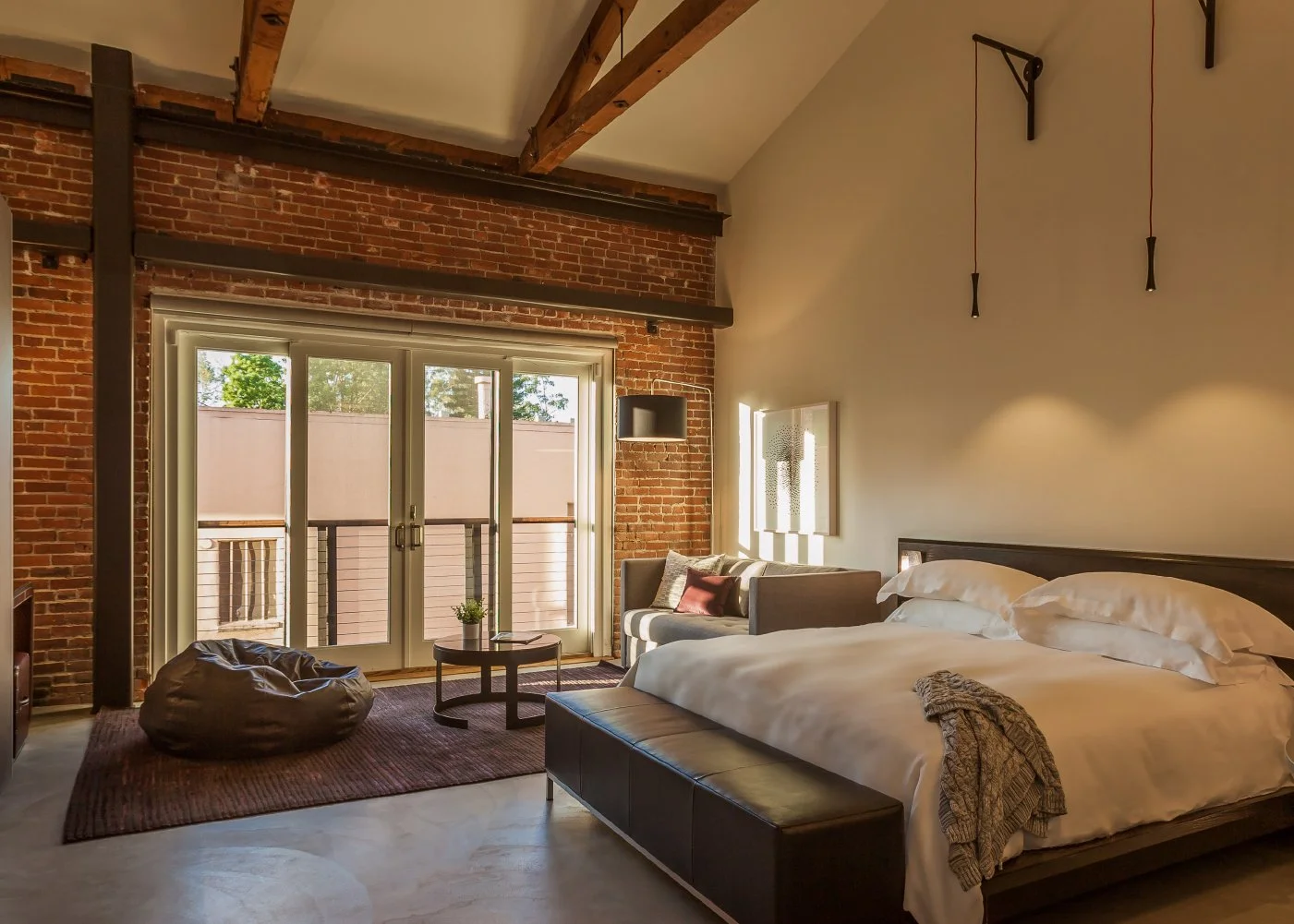
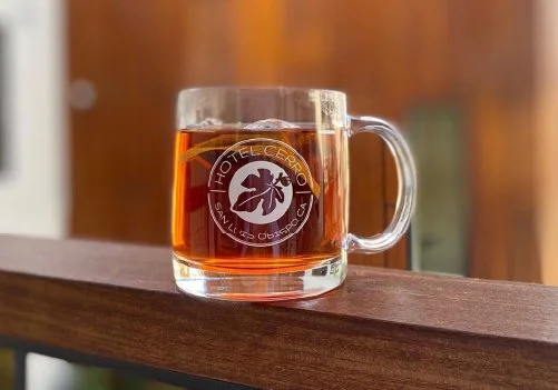
Hotel Cerro was the first luxury hotel to arrive in Downtown San Luis Obispo. The 65-room hotel included a brasserie-style restaurant, full-service spa, rooftop pool, in-house distillery, and grab-n-go pie shop.
The hotel was the first of it’s kind in the area and needed sophisticated, yet approachable branding to help set it apart.
BRAND GUIDE
TYPOGRAPHY
COLORS
PMS 703 C
PMS 5743 C
PMS 403 C
IMAGERY
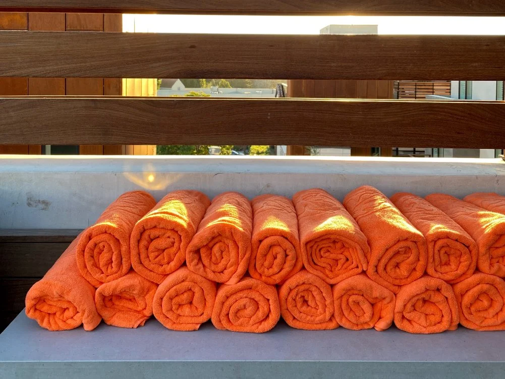
Rooftop Pool Deck
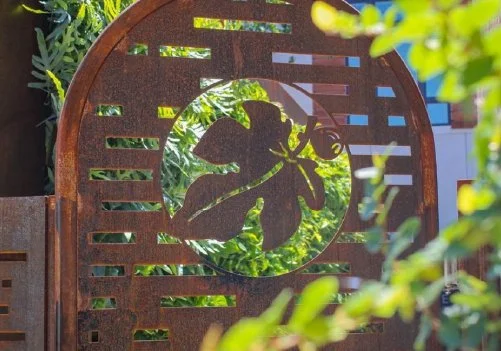
Edible Gardens

BRASSERIE SLO
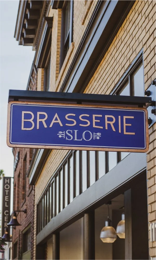
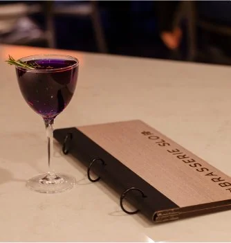
Brasserie SLO took shape as a core part of Hotel Cerro. The French-Mediterranean restaurant operated on its own — open to the public for all-day dining and private events. Additionally, it serviced hotel guests by way of room service and catering.
The restaurant took inspiration from European-style brasseries as well as the early 19th-century building it occupied. Its branding was created to respect this history and culture as well as interject some color and personality.
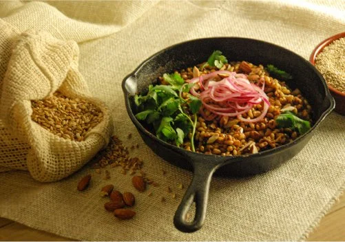
I photographed a selection of food and drinks used to build out the brand and market the restaurant.
TYPOGRAPHY
COLORS
PMS 7579 C
PMS 2747 C
PMS 7543 C
IMAGERY
The Veranda
Mission Fig Patio
The Distillery

SPA CERRO
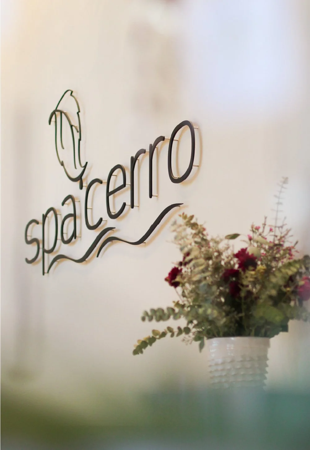
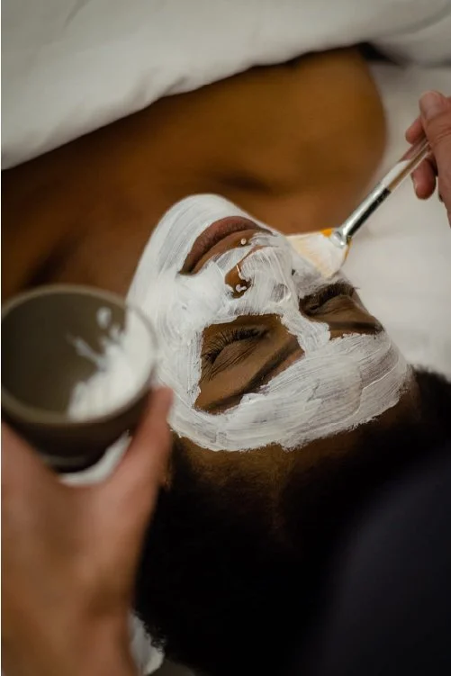
Spa Cerro was the first full-service spa to open in San Luis Obispo. The spa was built around luxe, wholesome treatments inspired by the land and sea. As with Brasserie SLO, the spa was open to the public but also worked in tandem with the hotel to enhance the guest experience.
The spa’s branding was created to mimic the hotel’s but took on a more natural, theme-appropriate look and feel.
TYPOGRAPHY
COLORS
PMS COOL GRAY 8 C
PMS 263 C
PMS 669 C
PMS 552 C
PMS 566 C
IMAGERY
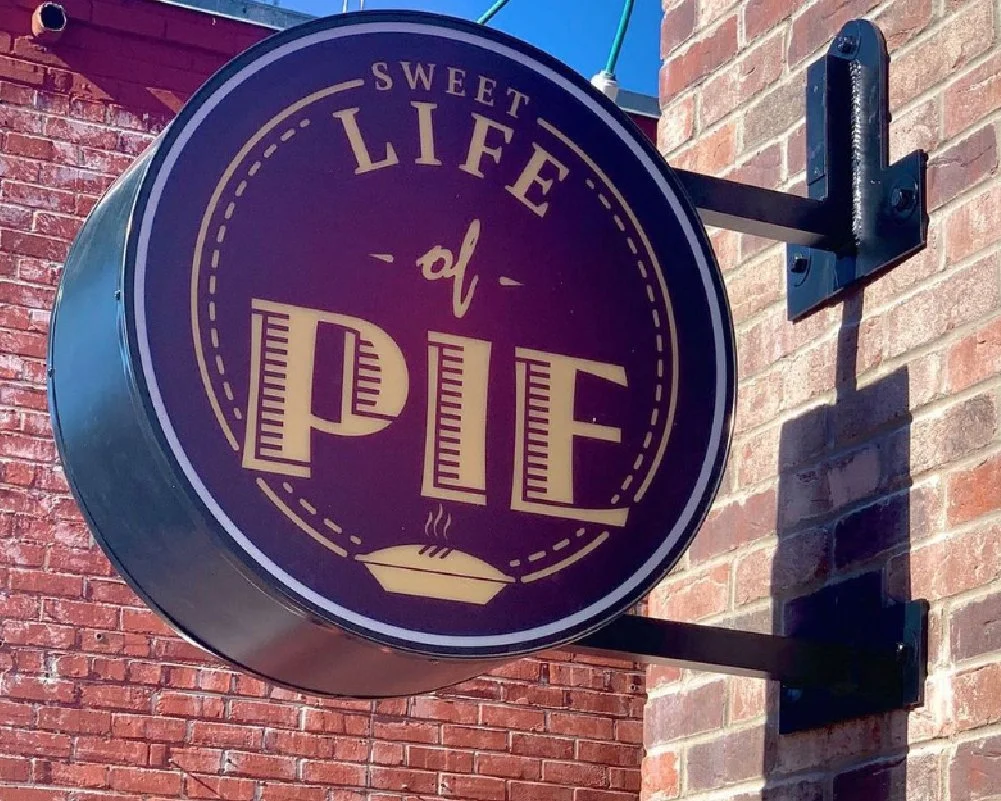
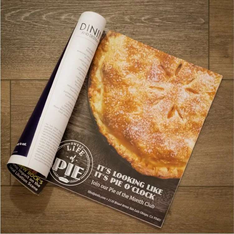
SWEET LIFE OF PIE
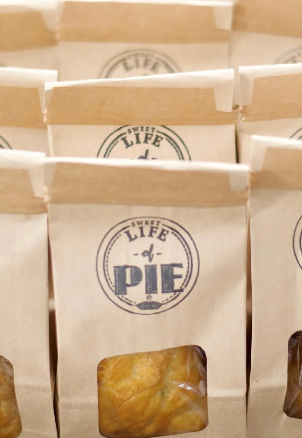
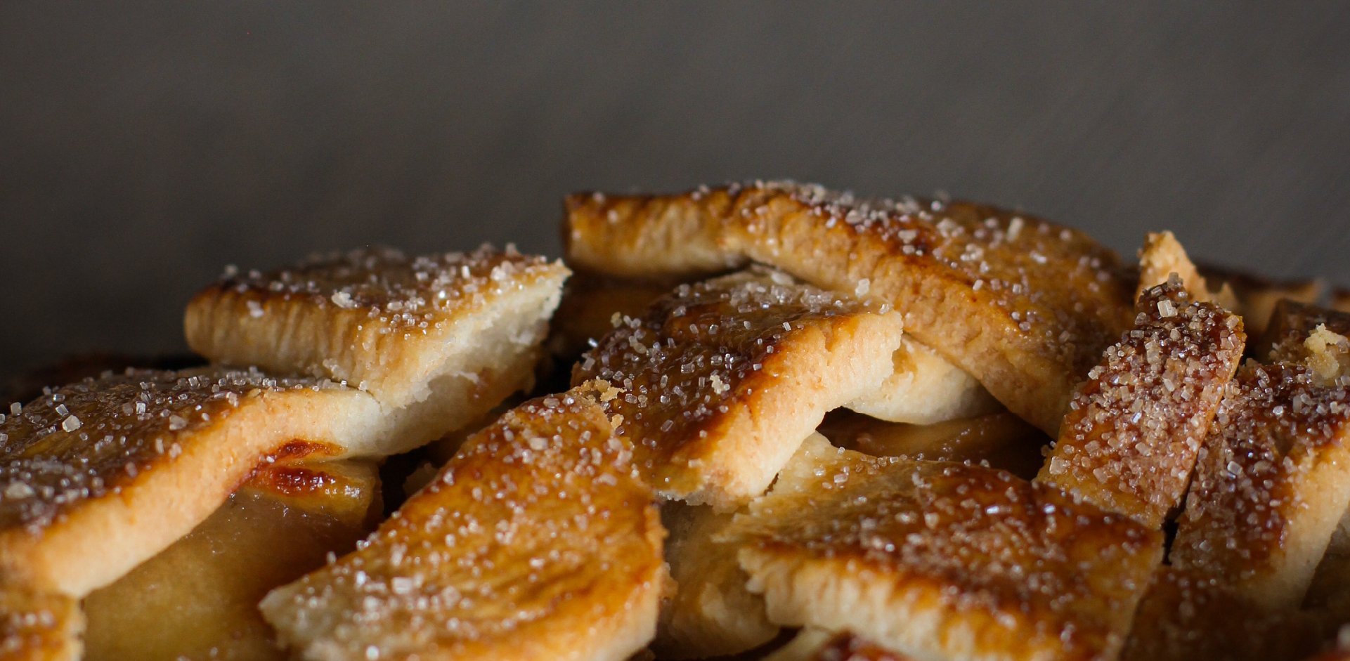
Sweet Life of Pie was created to satisfy a simple need: you can never have enough pie. The actual footprint of the pie shop was small so the store operated as a grab-n-go dessert destination.
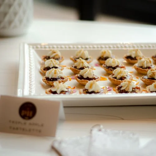
In the sea of amazing food and drink on the Central Coast, the pie shop differentiated itself by offering unique sweet and savory treats. The entire store menu was made with local ingredients made by Brasserie SLO’s pastry chef.
The shop’s branding was made to feel fun and sweet yet high-end — on par with each of the hotel’s amenities.
TYPOGRAPHY
COLORS
PMS 275 C
PMS 7403 C
PMS 7420 C
PMS 229 C
PMS 4655 C
IMAGERY

THE BRAND AND BEYOND
The brand guide was the first of many design projects I worked on for the hotel. These guidelines were extrapolated into many different forms as the property reached its grand opening and more and more of the team came on board.
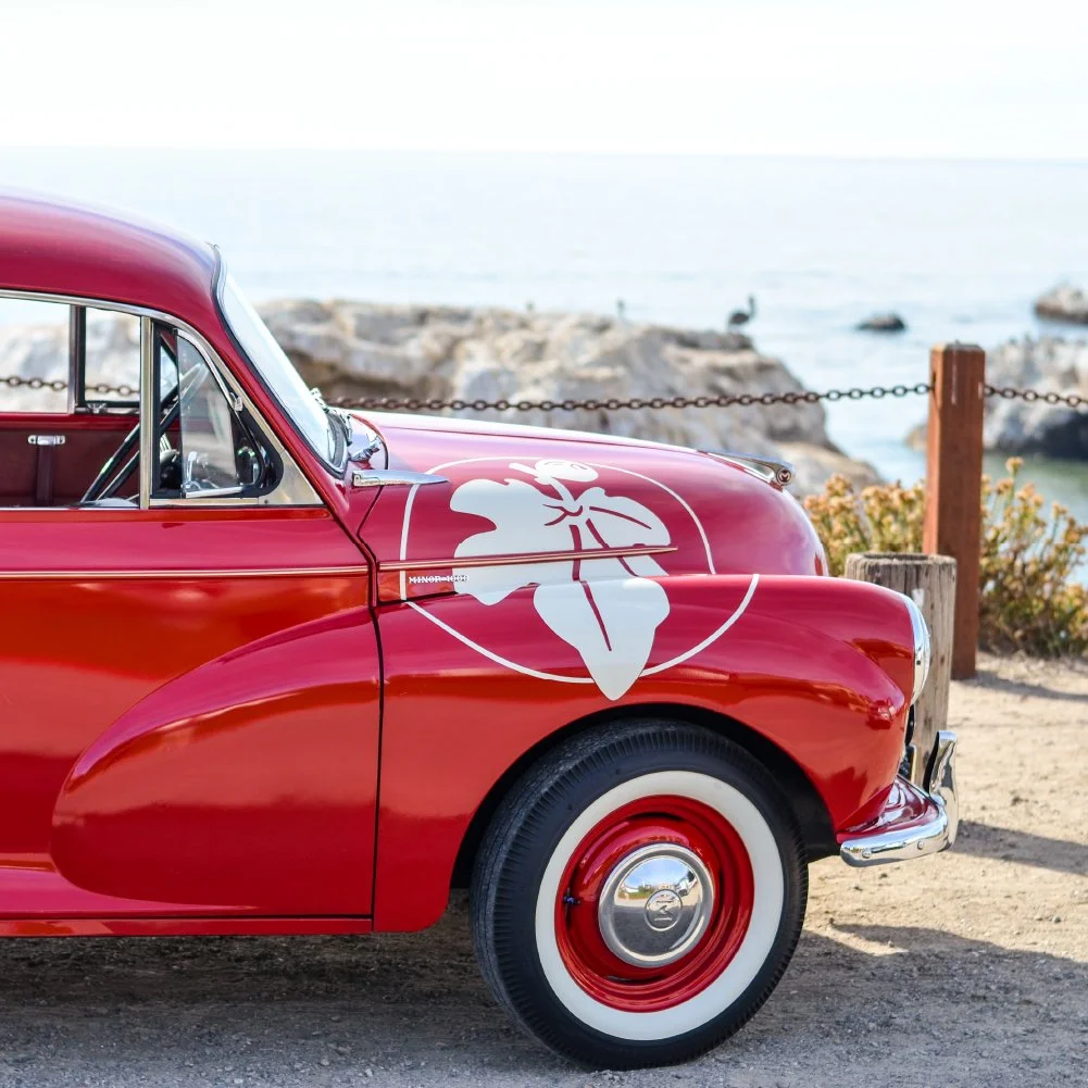
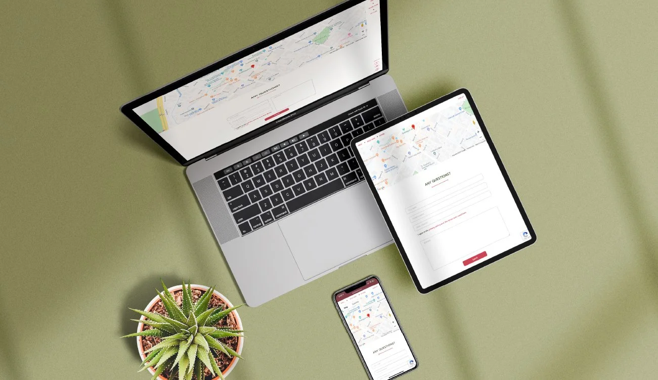
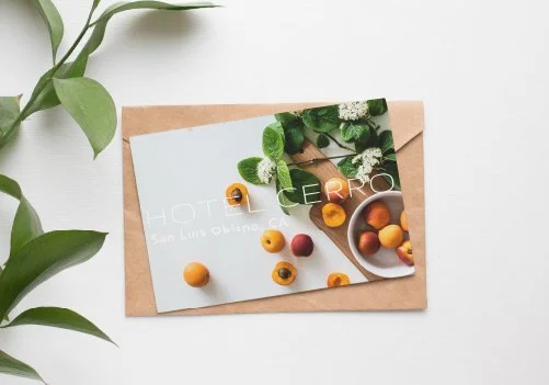
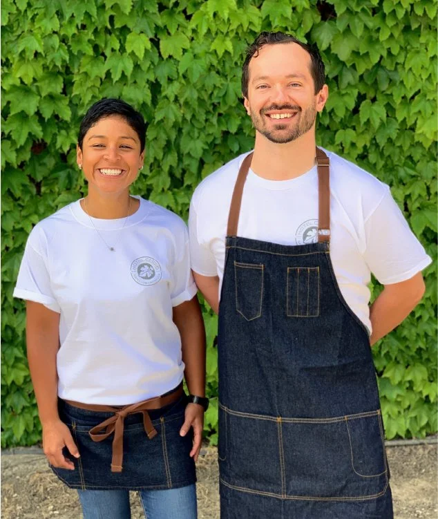
I worked to integrate the brand into projects including external signage, restaurant menus, multiple websites, email campaigns, car wraps, printed ads, collateral packages, and t-shirts. Many applications “broke” the rules but it was important to me that they maintain an approachably luxurious touch.


