NOFUQs Podcast Branding & Website
BOOMS, BANGS, BLUNDERS.
NOFUQS PODCAST
BRANDING & WEBSITE
Client
No Follow Up Questions
Deliverables
Logo
Brand Identity
Web UI/UX
Photography
Skills
Illustrator
Lightroom
Photoshop
Squarespace
Personal
Brief
I was tasked with designing a logo and building a website to stream the podcast episodes.
Goals
Create a brand that works well on multiple digital platforms. Find the interactions between modernity and youthful energy. Build a website that facilitates community growth.
Outcomes
I customized a typographic logo that is versatile and easily recognizable in a small format. I also built a website that can be adapted to fit the growing community and scale as the podcast did. This project had a really quick deadline, but I was happy to create something with a luxury feel under a time crunch.
NO FOLLOW UP QUESTIONS
The show where we talk about the booms, the bangs, and the blunders of living through your twenties. Each week we explore topics like making friends, dating, navigating our careers, and getting older.
I created this podcast with my cohost to explore a new creative outlet and build an online community.
SUBMARKS
BRANDING PROCESS
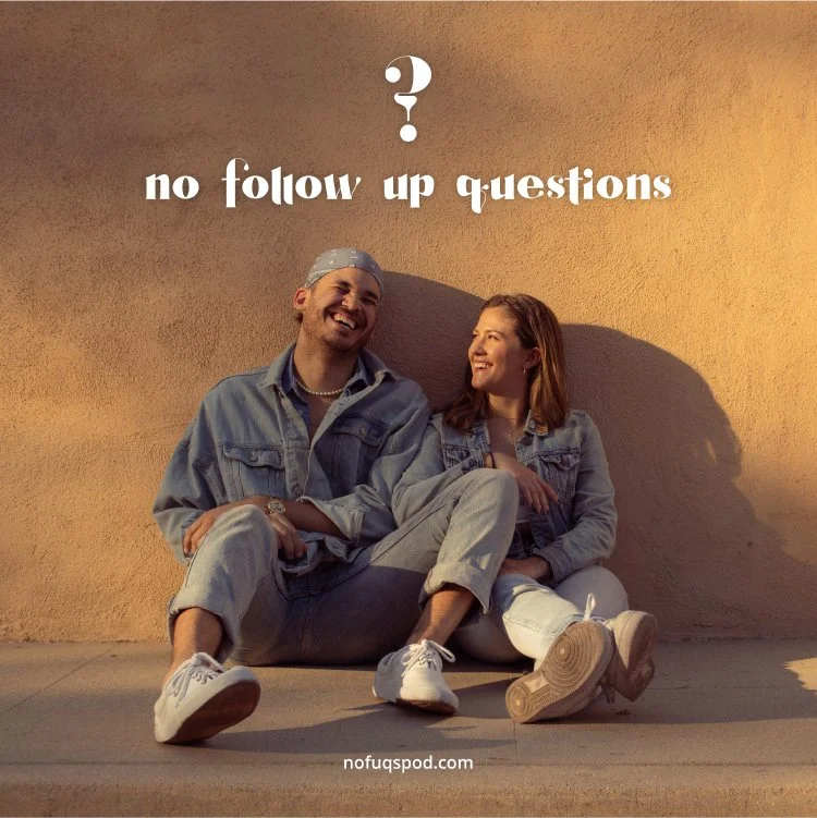
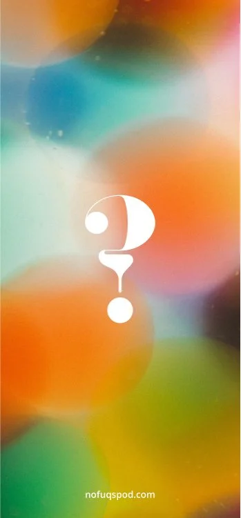
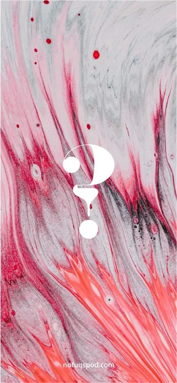
The logo started out with the ‘?’ character. I knew the full title needed to be on display to make the show recognizable, so I committed to a typographic primary logo. I adapted an eye-catching font into the final form and incorporated the question mark icon as the ‘Q’ in ‘Questions’.
Lastly, I planned on centering the brand around large-scale, colorful images. The simplified icon in its various colors was perfect for reinforcing the brand without having to use the full logo.

TYPOGRAPHY
COLOR PALETTE
#6286D3
#3C6E7C
#BEE2EA
#D14343
#9E4039
#E8A6A6
#F2F2F2
#CCCCCC
#FFFFFF
#000000
#4D4D4D
#808080
BRANDING APPLICATIONS
SITE PLANNING
Necessary Functions
House episodes as they come out as well as the full catalog of past episodes
Direct users to all of the show’s social accounts and streaming platforms
Offer extra information about the show and the two cohosts
Facilitate community growth by way of user-submitted questions and pertinent announcements.
User Flow
Mood Board
UI/UX PROCESS
Throughout the site construction process, I maintained a minimal hand.
I first asked myself “what are people most interested in when they come to this website?” Then, I focused on building a visual and functional hierarchy that felt appropriate. At the top, users see the show’s logo, then the tagline which helps pique interest, and finally all of the episodes are on full display.
The brand is image-centered so all unnecessary verbiage was eliminated. Whatever text remained was set in a typeface that looked interesting in a black and white color palette and conveyed the feeling of youthful sophistication — serious but not too serious.
Working with Sqaurespace was a clear choice because the templates were easy to manipulate into something I liked and all of the content was instantly mobile-friendly. Ultimately, I worked to create a site that could be updated and scaled up at a moment’s notice.


