Memento App Design
CURATE LIFE’S BEST MOMENTS.
MEMENTO
APP DESIGN
Deliverables
Logo
Brand Identity
Mobile UI/UX
Skills
Illustrator
XD
Coursework
Brief
I was tasked with creating a photo album, social sharing app for travelers and creatives that maintained a sleek design and prioritized usability.
Goals
Design a beautifully simple, yet versatile app. Build high-fidelity prototypes that are informed by user research and iterative mockups.
Outcomes
I created a complete brand identity that fed into the UI/UX process. The final package included wireframes and full mockups. A lot of my user research and iterations are not shown here but this project included memorable exploration.

Memento is a photo album, social sharing app for travelers and creatives — many of which have libraries full of unused, unseen photos and videos. It’s the perfect place to catalog and share collections and memories themed around past vacations and life events. This new platform prioritizes creative camaraderie, cultural and geographical admiration, and above all else: connections with friends and family; not ads.
MEMENTO
SUBMARKS & APP BADGES
MOOD BOARD
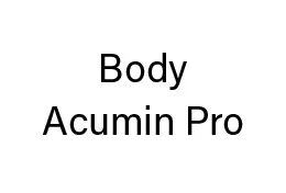
TYPOGRAPHY
Title
Headings
Paragraph
COLOR PALETTE
#000000
#E2E2E2
#B6A08F
#E2C758
#E5D0C8

BRANDING PROCESS
When creating the branding for this app, I wanted to maintain a minimal touch. The app is all about letting the users add life and color so the interface itself needed to take a backseat; understated but not invisible.
The majority of the app was kept in black and white to emphasize the ‘blank canvas’ feel.
For the logo itself: I was inspired by the North Star and its symbolism for lost travelers. You can see the star emphasized in all three versions of the logo and interpolated into the icon sets of the app.
In the end, I created a full logo set, an app badge, icon sets, font pairings, a color palette, and sample imagery to use throughout the app.
USER RESEARCH
Main App Functions
Organizes user images and video loops into themed albums called ‘Mementos’
Lays user images, video loops, captions, and stickers out in editable templates
Shares Mementos with users’ followers
Groups Mementos from multiple users into location/event/interest-specific collections to be viewed by all users
Target Users
The Traveler
Young & free
Prioritizes experiences over souvenirs
The Photographer
Tech-savvy
Sees life through the lens
The Influencer
Loves online community
Highly engaged on social media
The Creative
Finds inspiration from others
Career-focused
User Personas
Jacob // 24
Freelance travel photographer & digital nomad
Interested in foods, languages, plants, and thrilling experiences
Wants a place for nice photos that don’t make it onto Instagram
Tiana // 31
Illustrator & animator for Disney
Single mother of a 2-year-old boy
Very hard working, yet dedicated to spending time with her family
Uses social media as a hybrid blog for both work events and life events
Aubry // 20
Heavily involved student, sorority member, and lifestyle vlogger
Interested in social events with sorority sisters, volunteering, politics, and film-making
Considers herself an activist
Posts regularly on socials and engages with followers multiple times throughout the day
SITE ARCHITECTURE
Site Map
Wireframe Map
Login/Sign Up Sequence
Main Feed
ICONS
UI/UX PROCESS
This project went through multiple stages of research, design, and prototyping. I took a ‘from-basics’ approach by starting with the question: “What problem will this app solve?”
From there, the research was edited down into the fundamental personas and target users. This allowed me to create functionality that offered solutions to the initial problem.
The architecture of the app was made to be as slim as possible — any unnecessary pages or buttons were taken out. I tested multiple sequences with my classmates to make sure the app was robust enough to be helpful but easy enough to be understood by the target users.
Lastly, I delivered a set of high-fidelity prototypes that illustrated my final vision and helped to show off the app in full color.


